Nabdish Gill

Overview
This project was done as part of a capstone study group project.
Big River collaborated with Abletech to develop a platform(Koha) where whānau or individuals can extend a helping hand to make meaningful contributions to those in need.
Koha aims to preserve the cultural essence of traditional practices like ‘Takoha’ while adapting them to meet the needs and challenges of modern times.
Problem
The current onboarding doesn’t reflect the high quality of the user experience, and the Koha team needed our help testing the current user flows.
Our Goal
Analyse the current app user flows to pinpoint where users encounter problems. Research the brand to effectively convey its values through the application and also learn the effective strategies of competitor apps. Provide a mobile version of the improvements to address user issues.
Constraints
-
Maintain the original colours and typography.
-
Entry points should be through brochures and personal messages.
-
Keep some of the jargon as is.
Our Approach
Our approach to the Koha project started with desk research to understand the concept from a Māori perspective, focusing on its cultural context and how it can translate into digital space. We also conducted an MVP teardown to analyse core functionalities and a competitor teardown to identify gaps and opportunities. This combined approach helped us create a culturally aligned and user-focused design strategy.
Usability Testing
Prototype

MVP
Usability Testing
Competitor
Usability Testing
Evaluative
Usability Testing
Usability Testing
I explored the application's "create event" and "home page" navigation and conducted usability testing, observing participants' confidence, emotions, speed, and errors while performing tasks. Also users were assessed on their familiarity with the Takoha concept.
The team conducted 13 usability tests on locals and students in the initial testing phase and 6 tests on the final prototype.
Key Insights
-
Users were indecisive about their choices in the current user flows. They found the information (guide) insufficient, the terminology was hard to understand, and the flows seemed too long.
-
It was difficult for users to get familiar with the app quickly; the layout and indistinct UI elements created confusion.
Ideation
I conducted a design workshop with the Abletech dev team to explore the different approaches and identify any limitations the team might have while implementing any re-design I suggest. I also referred to many best practices on the web and discuss them with our team and the dev team to get more insights on there feasibility.


Design Principles
Create consistent layout
Complicated layouts can be confusing, so it's best to keep things simple and straightforward. This way, a wider audience will become familiar with the design quickly.
Provide key information to guide user
It should not be assumed that everyone understand terms like mihi or tikanga. Giving information to guide users, should be considered to make App more inclusive.
Preserve cultural essence
It is up to us to ensure that the traditional takoha-giving practices in physical spaces are appreciated and appropriately translated into digital space.

Redesign
Streamlined Navigation
Header(Profile): To make users quickly familiar with the app I adopted widely used standards across various platforms
Tabs: New top tabs design for better visibility
Nav Bar: Features were recategorised, minimised, and consistently positioned
Cards IA
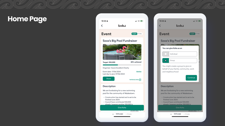
Re-thought the information architecture to enhance user’s overview at the first glance.
-
Overflow menu to quickly access some of the settings
-
Progress bar gives a snapshot of how the event is doing
-
Status label on the card to indicate the various states of event could be in. e.g. Active, Approved
-
Buttons communicating clearly primary and secondary actions

Cultural Appreciation
-
Mihi is an important aspect of giving koha, and often, the mihi and koha amount a person gives is kept for future reference.
-
therefore I designed the ability to ‘favourite’ specific mihis'

Iterations
I conceptualised the initial versions of the home page, and group collaborated on the final version.
v1
v2
v3


Infographic
To cover the various aspects of our capstone project, we worked in two teams. Ling and I worked on delivering a report and infographic to sum up the entire project while the other half of the team worked on testing and refining the final prototype.

Ways I would like to improve this project...
-
Include stakeholder interviews to understand the brand identity in more detail and future vision of the brand.
-
Test the prototype within Māori community.
-
Gain a better understanding of Takoha in the physical space.
2025 © Nabdish Gill


